Brand Identity: Lake County Democratic Women
Lake County Democratic Women’s mission is to help the women of Lake County, IL build connections in their community, get involved, and work toward reaching the goal of women making up 51% of those in office.
Deliverables: Logo, website, icons, illustration
Logo design
The new logo refines the original intent while enhancing usability and legibility.
The woman in the logomark looks to the left as a nod to the Democratic Party and upward suggesting confidence and empowerment.
Her face flows with the natural outline of the state. Her hair cascades through the state, reminiscent of the stripes on the American flag, sweeping from north to south. The star in the first strand represents the placement of Lake County in the state. The roundness and subtle femininity of the typography suggests a welcoming and friendly environment and balances out the strength of the mark.
Illustration
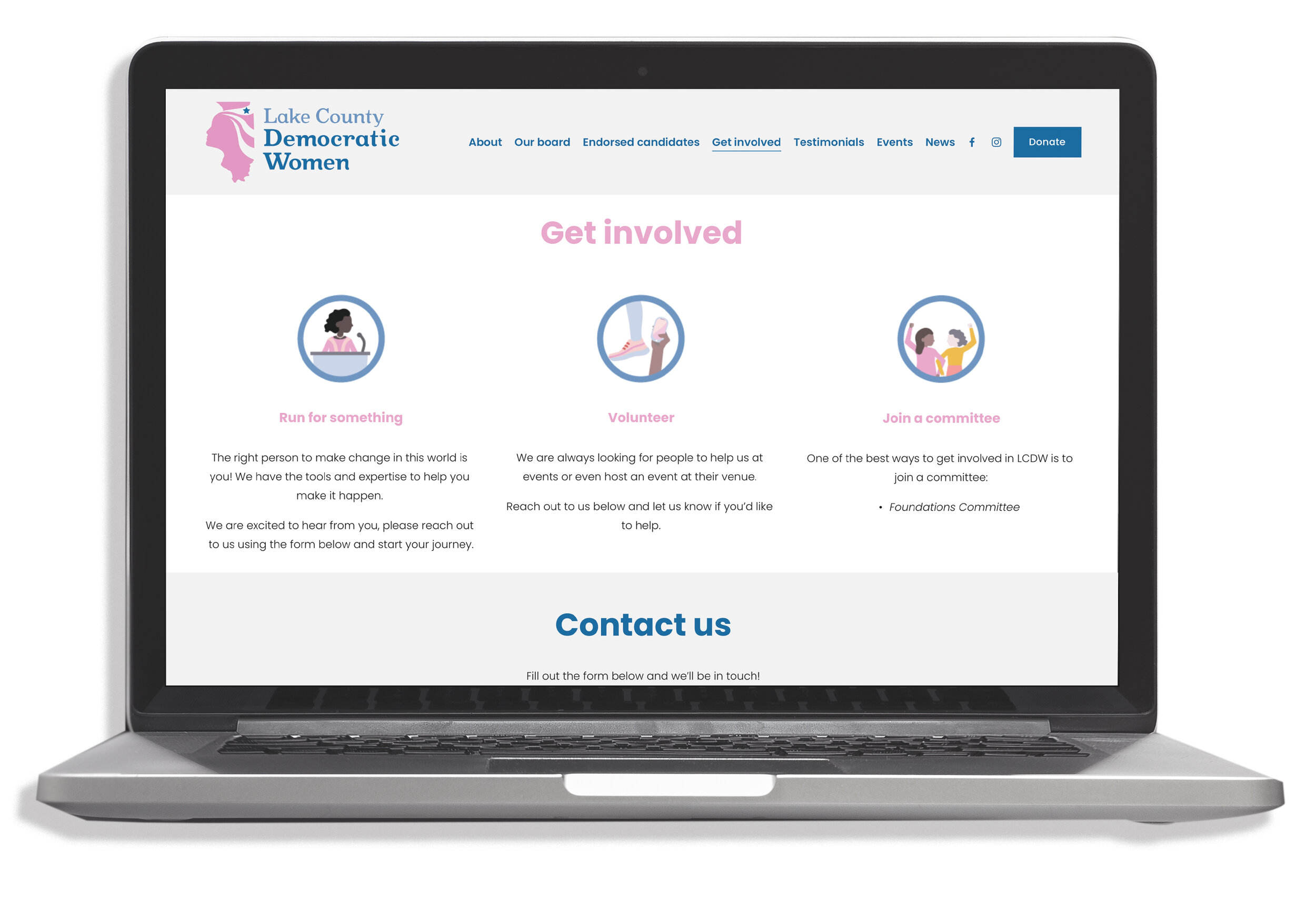
To support the brand, I created a series of illustrations that utilized the brand’s color scheme and added some playfulness to their various materials.


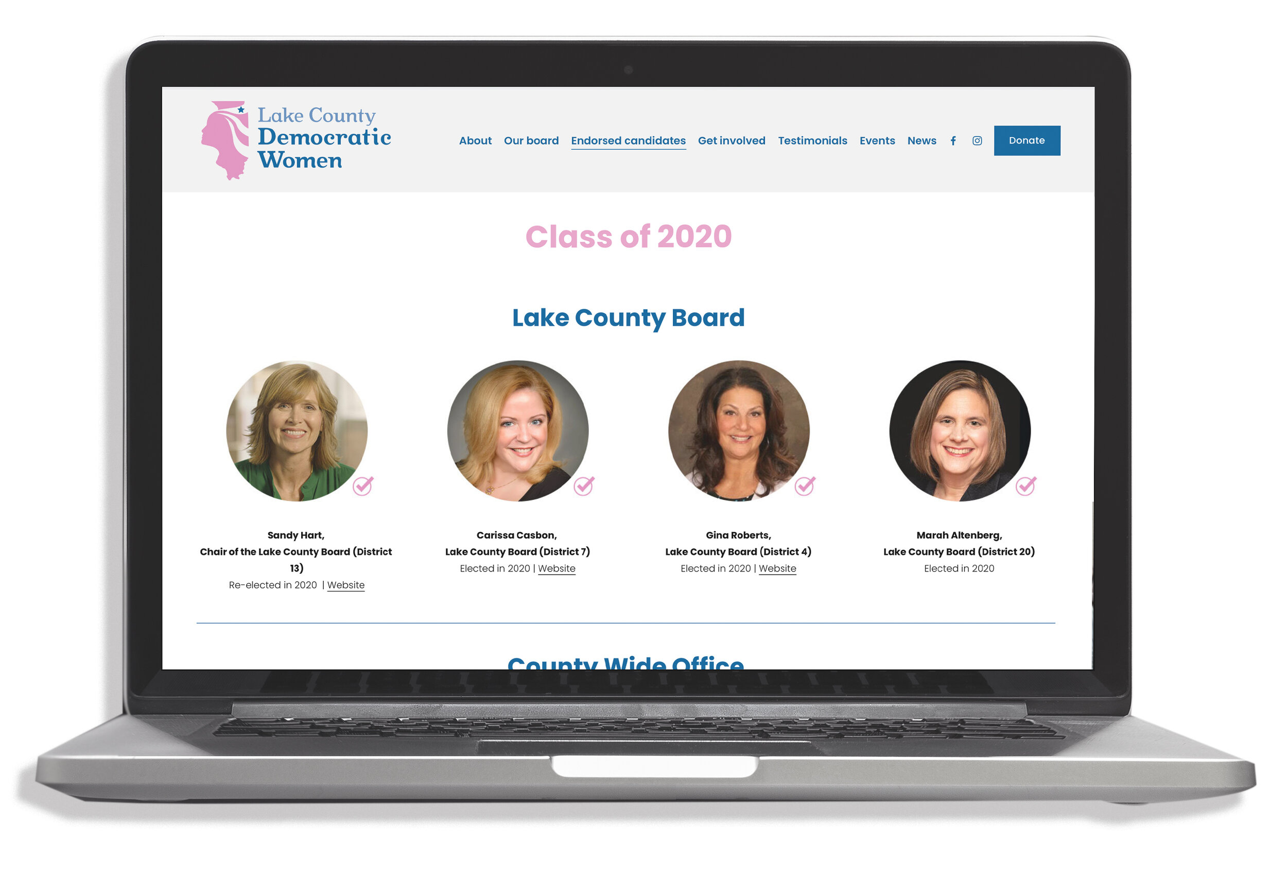
Website
When building the website, ease of use and navigation were the key factors when it came to design. LCDW wanted something clean and simple that communicated friendliness and professionalism.


